Bookly
Bookly is a library website for book lovers — ratings and reviews, book clubs, home delivery, and personalized recommendations so finding the next read feels easier than fighting library hours.
Project Overview
Duration: Sep–Nov 2022
Role: UX Researcher and Designer
Responsibilities: User research, wireframing, affinity mapping, prototyping
Problem: Busy readers want community and discovery, but library hours and pickup logistics get in the way — and existing flows rarely offer ratings, clubs, or personalization.
Goal: Design a seamless library experience where users can discover books, join community moments, and choose delivery or pickup without losing the feel of a real library.
Understanding the User
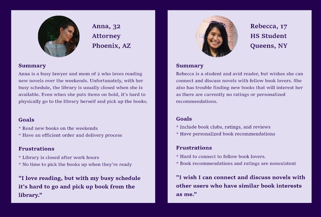
I interviewed book lovers across ages and lifestyles, then synthesized two personas that kept delivery, community, and discovery grounded in real constraints.
Information Architecture
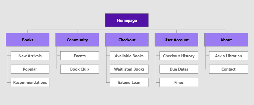
The sitemap kept ordering as the core flow, with community and account tools supporting discovery and trust:
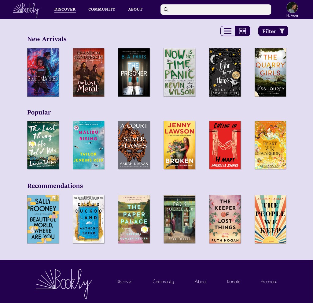
- Books — New Arrivals, Popular, Recommendations
- Community — Events, Book Club
- Checkout — Available Books, Waitlisted Books, Extend Loan
- User Account — Checkout History, Due Dates, Fines
- About — Ask a Librarian, Contact
Starting the Design
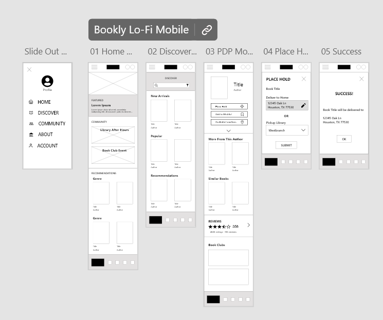
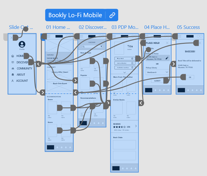
Mobile wireframes mapped the full place-hold journey: menu → home → discover → product detail → delivery vs pickup → success. Low-fidelity prototypes connected that flow before visual polish.
Usability Study & Affinity Mapping
Study type: Unmoderated usability study (remote, United States)
Participants: 4
Length: 10–20 minutes
Affinity notes clustered feedback into four themes:
- Choosing a book — Prefer a search bar over a search button; suggested titles on the PDP helped; action buttons felt clear.
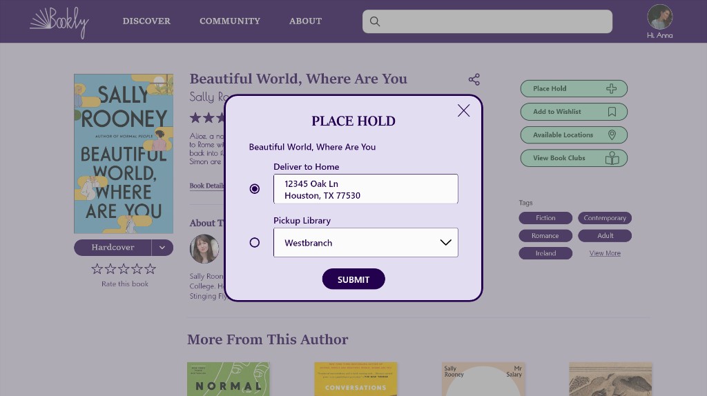
- Place hold / ordering — Confusion around double clicks and broken buttons; prefilled location didn’t behave as expected; account creation still felt risky for some.
- Finding new arrivals — Generally easy, especially with persistent top navigation.
- Overall site — Curiosity about Community and book clubs; “bland but serviceable” sat next to “great website.”
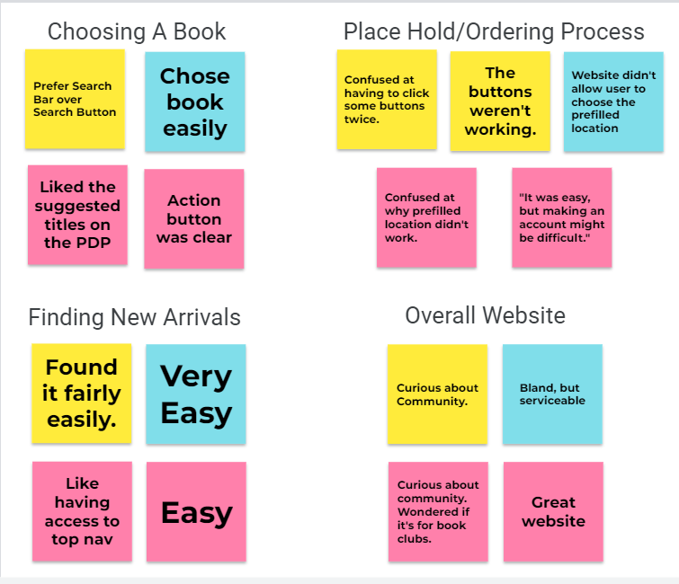
Design changes that followed: sticky top nav with a real search bar, a clearer ordering path, and a stronger community presence.
High-Fidelity Website
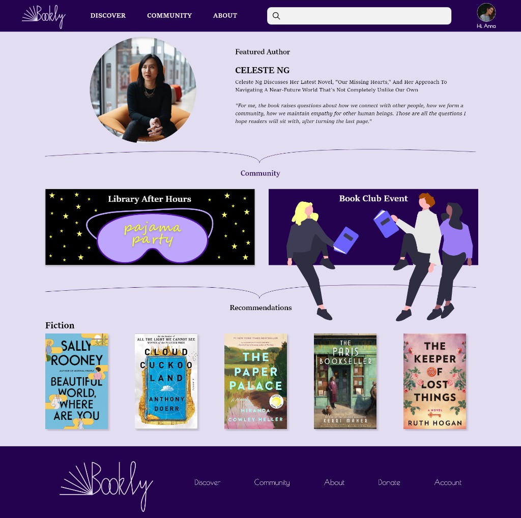
The polished desktop experience leans literary — deep purple branding, serif titles, and soft lavender surfaces — while keeping utility actions obvious: place hold, wishlist, locations, and book clubs.
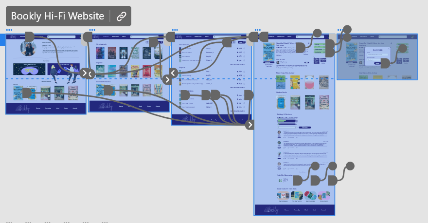
Prototype Demo
A walkthrough of the final prototype flow:
Accessibility Considerations
- Contrast checked against accessibility guidelines across purple UI surfaces.
- Home delivery supports users who cannot easily visit the library in person.
- Clear labels and persistent navigation keep key tasks available while scrolling.
Takeaways
Impact: Testers responded to “More From This Author” and “Similar Books” as useful discovery cues — the site felt believable as a library, not just a catalog dump.
What I learned: Sticky search and a trustworthy hold flow matter as much as beautiful covers. Community is a magnet — but only if the ordering path already works.
Next steps: Expand Community, streamline account creation, and surface expected availability windows during place hold.